

Project 03 · Interior branding · Property
The Estate Agents 1977
A reception feature that belongs in the room.
For The Estate Agents, the brief was not simply to put a logo on a wall. It was to create a confident focal point for a customer-facing office.
The project
Built around the place, the audience and the job.
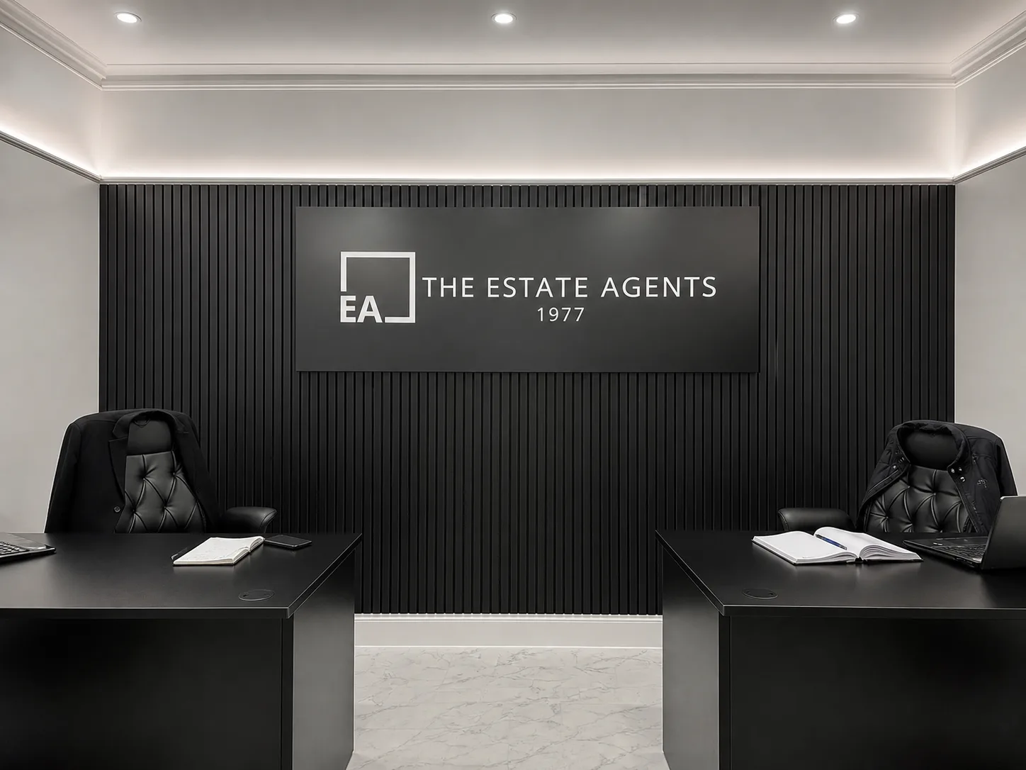
The strongest part of this project is the relationship between the sign and the room. The matt-black panel, white identity and vertical slatted wall were treated as one composition, giving the reception a clear backdrop without introducing another colour or competing finish.
- Interior signs
- Dimensional graphics
- Wall-mounted panel
- Installation
The brief
The existing interior already had a strong monochrome palette and a slatted feature wall. Any sign needed to sit cleanly against that texture, remain easy to read and feel consistent with the finish of the wider workspace.
What we delivered
A large matt-black panel creates a quiet visual field for the white brand mark, name and date. The dimensional elements bring depth without adding unnecessary colour, while the wide format mirrors the proportions of the desks below.
Why it works
The identity is now the natural centre of the room. It photographs well, reads immediately on arrival and gives the office a permanent branded backdrop without overwhelming the space.
Behind the finished sign
The project, from more than one angle.
Several finished views show how the panel holds its presence from the entrance, across the desks and at closer viewing distances.
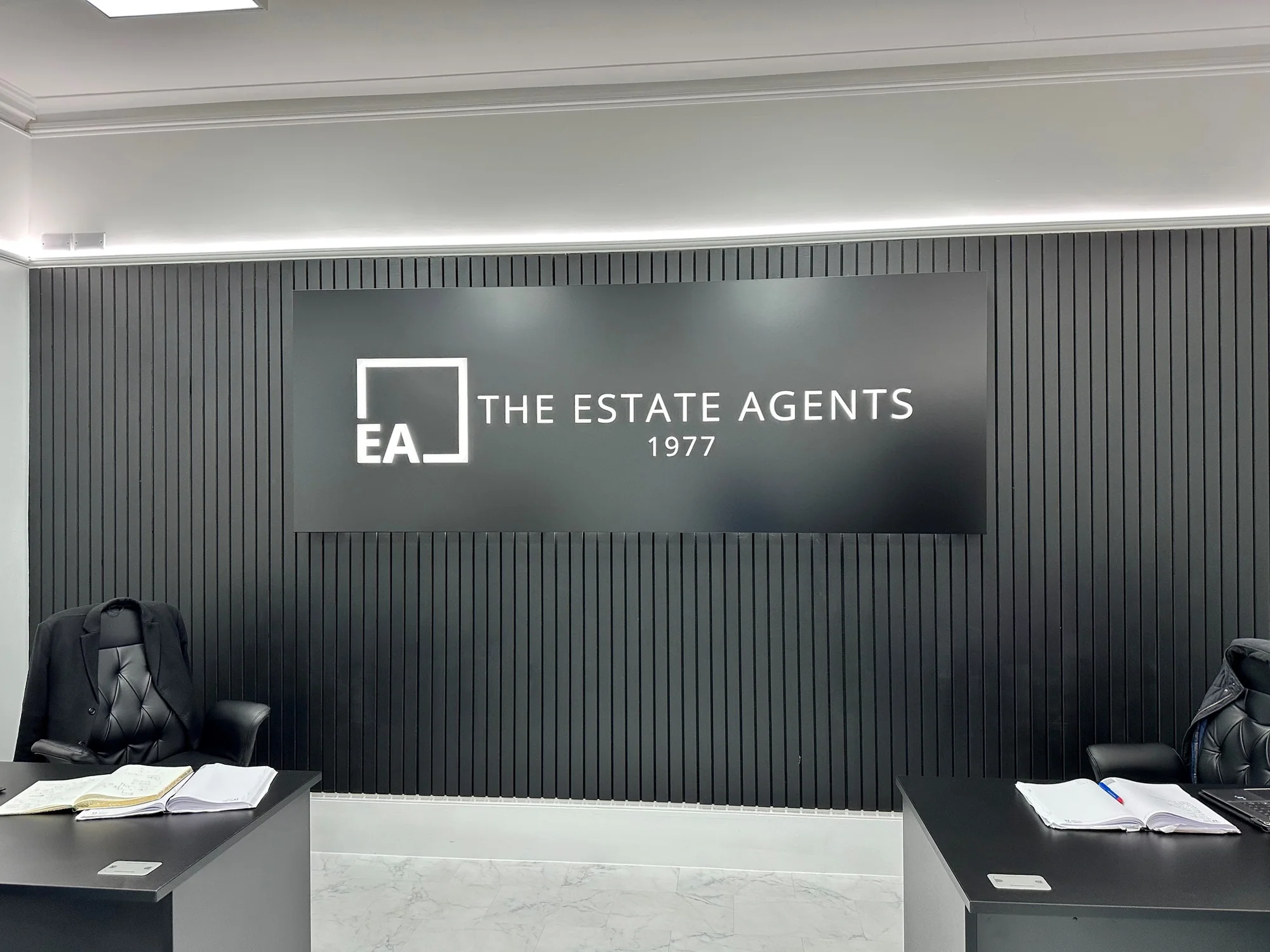
The identity centred between the two work areas
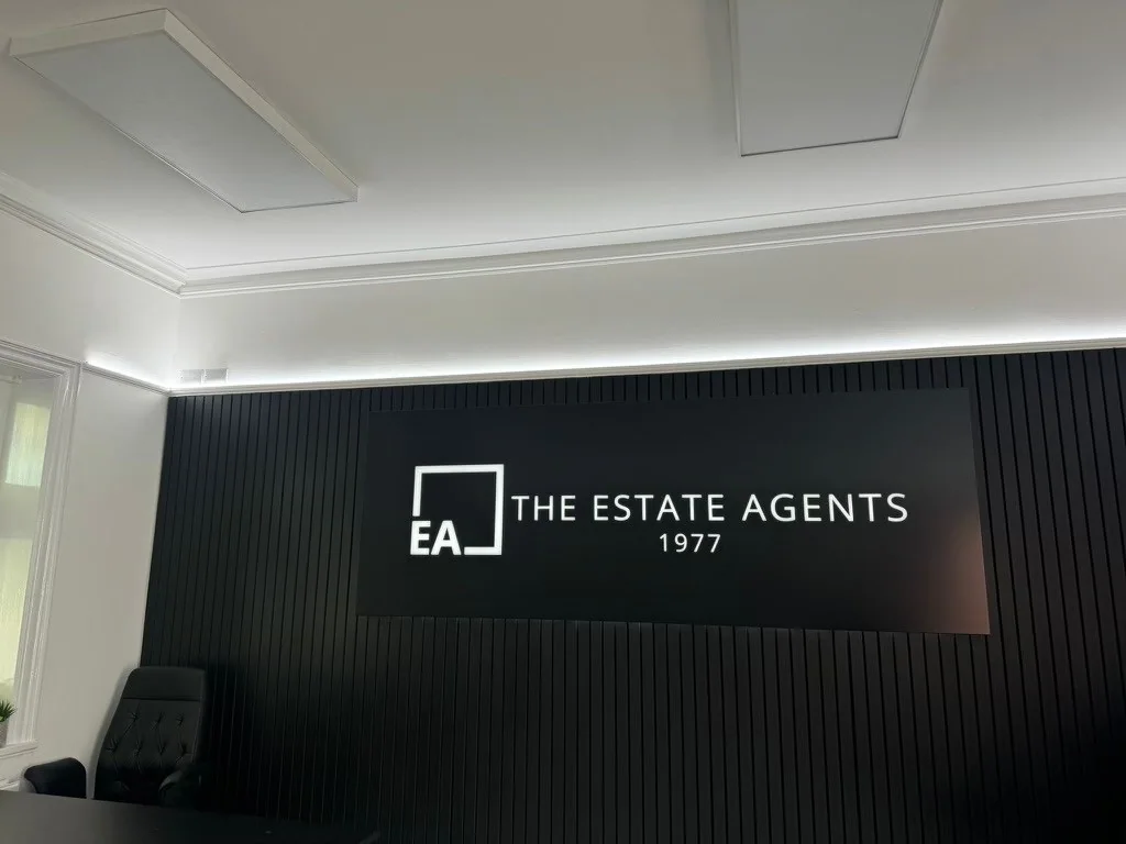
The black panel integrated with the slatted feature wall
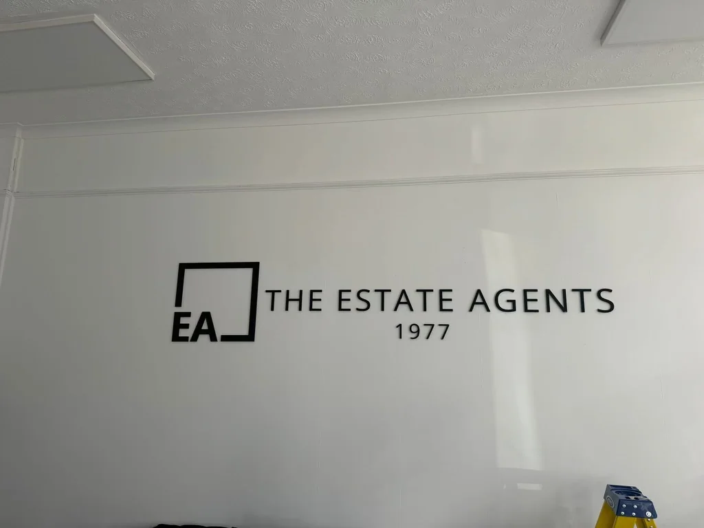
The same identity carried into a lighter room