Design · Manufacture · Installation — Wellingborough, Northamptonshire

Get a quote

Selected work · Made in Northamptonshire

Made here. Fitted by us. Still standing.

Six real projects, from customer-facing shopfronts to distribution-site wayfinding—each with the thinking, production and fitting behind the finished sign.

01 / Selected case studies

Six real projects.
Six different problems solved.

From a complete High Street transformation to joined-up signage across a live distribution site, this selection shows how the right sign responds to its setting, its audience and the job it needs to do.

Content draft · Customer names and project details subject to final approval
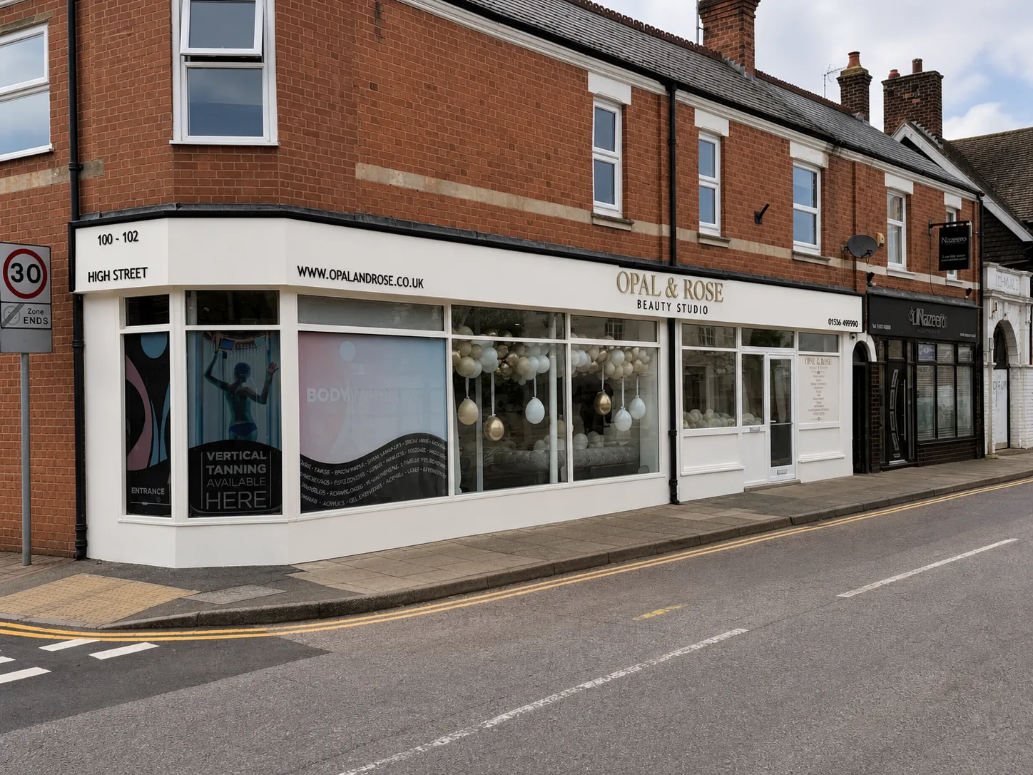
Retail signage · Beauty & wellnessOpal & Rose Beauty Studio

A long High Street frontage, made to feel like one brand.

Opal & Rose needed a shopfront that felt calm and premium across a wide corner unit, while remaining clear to passing traffic.

The brief

The fascia runs across two elevations and carries several practical messages, so the hierarchy mattered. The studio name had to lead; the address, web details and service information needed to support it without making the frontage feel busy.

What we delivered

We used a light, restrained fascia treatment with dimensional metallic-effect lettering for the main identity, then kept every supporting detail crisp and dark. Window graphics and entrance information continue the same visual language at eye level.

Why it works

The completed frontage reads as one considered destination rather than a collection of separate panels. The name is visible from across the road, while the closer details reward customers as they approach.

  • Fascia signage
  • Dimensional lettering
  • Window graphics
  • Installation
View the full project
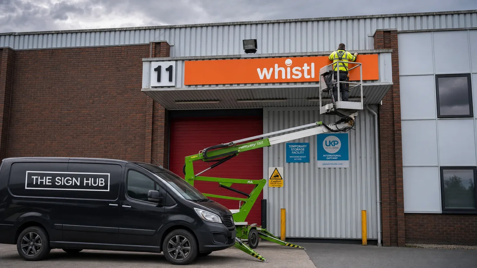
Site signage · LogisticsWhistl

One joined-up signage system across a live distribution site.

Whistl required a coordinated system for vehicle routes, goods movements, safety information and high-level bay identification.

The brief

Drivers and employees needed to understand each next action quickly, often while moving through a busy operational environment. The system had to remain consistent across perimeter fencing, gates, the yard and warehouse entrances.

What we delivered

We produced a family of high-contrast signs using repeatable colours, arrows and message hierarchies. Site maps explain the overall route, while individual panels address each decision point.

Why it works

The site now communicates as one system. Large messages work from vehicles, detailed boards support people on foot, and the Whistl identity stays visible without competing with operational information.

  • Site wayfinding
  • Safety signage
  • High-level fascia
  • Bespoke panels
  • Installation
View the full project
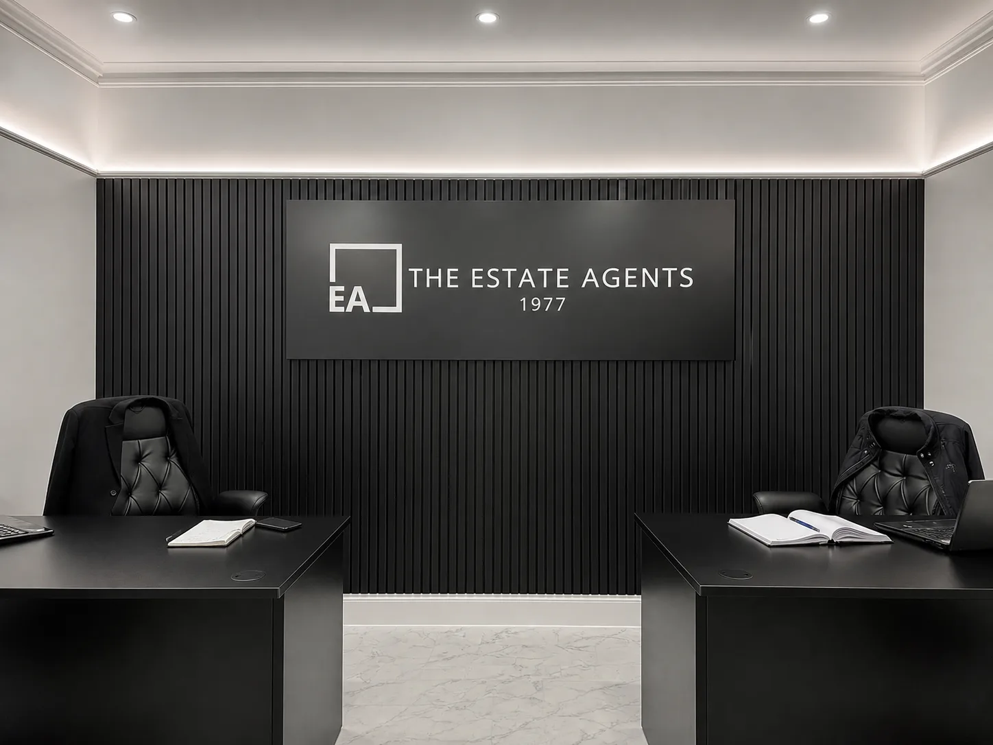
Interior branding · PropertyThe Estate Agents 1977

A reception feature that belongs in the room.

For The Estate Agents, the brief was not simply to put a logo on a wall. It was to create a confident focal point for a customer-facing office.

The brief

The existing interior already had a strong monochrome palette and a slatted feature wall. Any sign needed to sit cleanly against that texture, remain easy to read and feel consistent with the finish of the wider workspace.

What we delivered

A large matt-black panel creates a quiet visual field for the white brand mark, name and date. The dimensional elements bring depth without adding unnecessary colour, while the wide format mirrors the proportions of the desks below.

Why it works

The identity is now the natural centre of the room. It photographs well, reads immediately on arrival and gives the office a permanent branded backdrop without overwhelming the space.

  • Interior signs
  • Dimensional graphics
  • Wall-mounted panel
  • Installation
View the full project
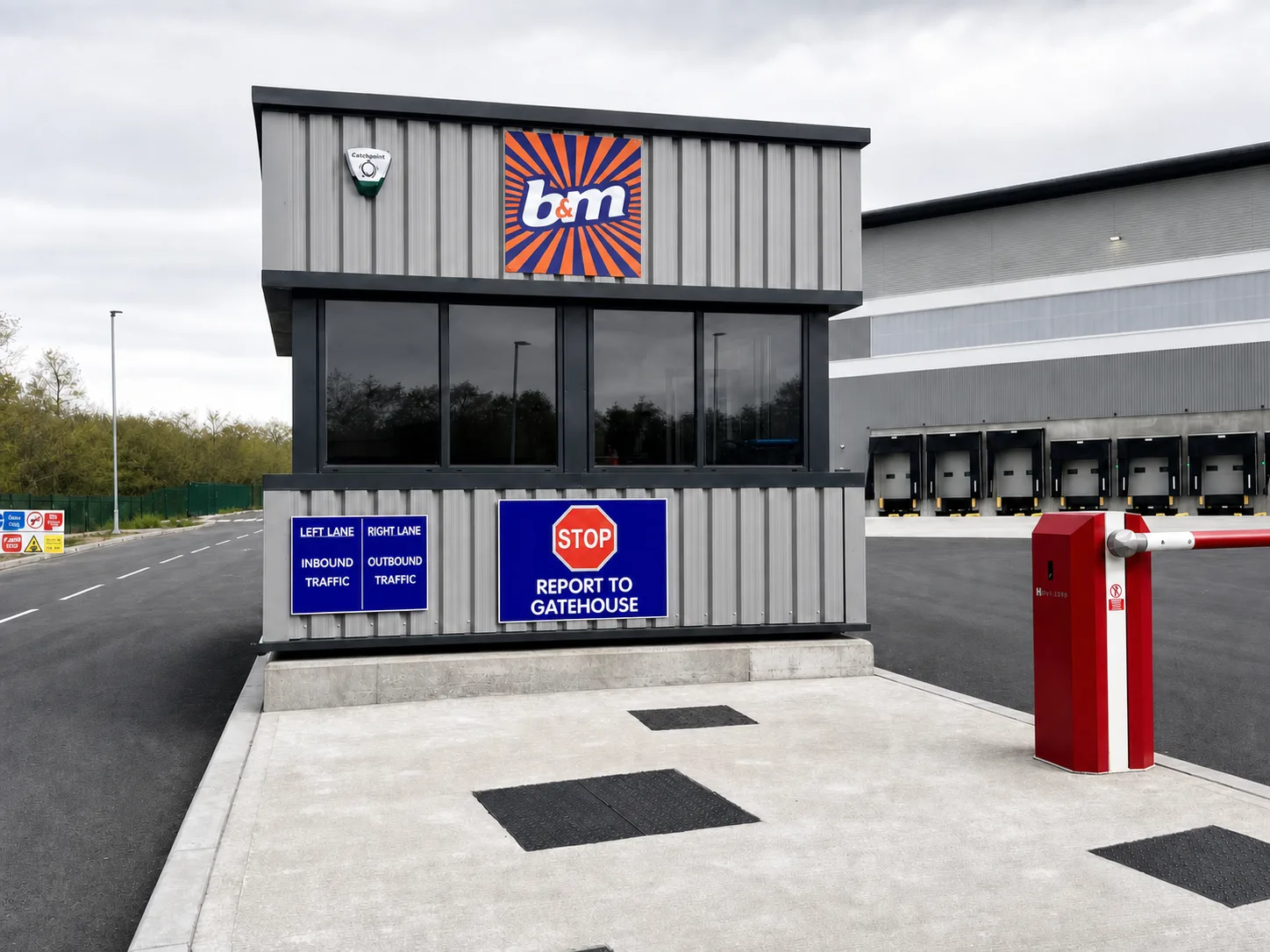
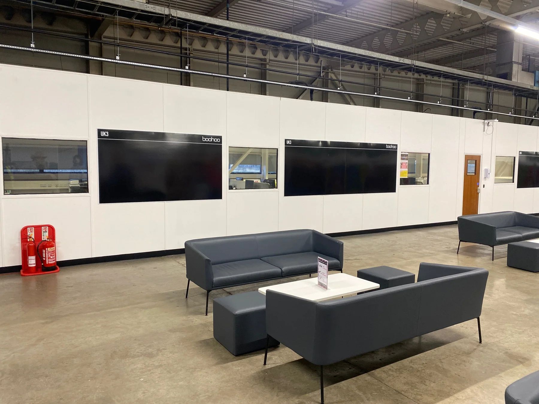
Site signage · DistributionB&M Distribution

One signage programme, from the gatehouse to the working wall.

Across a busy B&M distribution site, the signage had to guide vehicles, support day-to-day operations and bring the same visual language into the workplace.

The brief

Drivers and staff needed clear information at very different scales: lane choices before the barrier, operational messages around loading areas, and shared priorities inside the training environment.

What we delivered

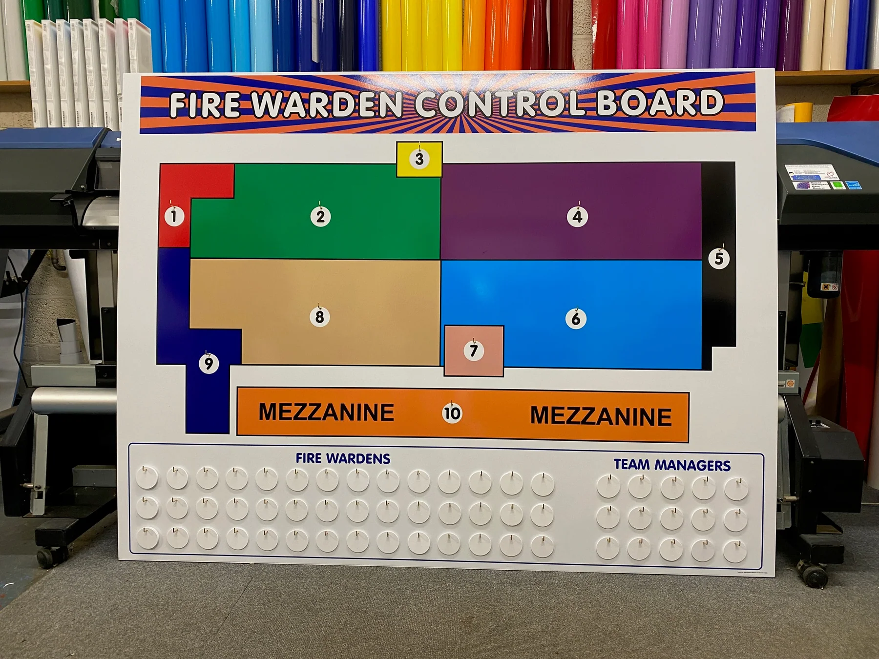
We created a coordinated family of exterior branding, directional signs, control boards and environmental graphics. Strong colour and disciplined information hierarchy make each message work at its intended distance while keeping the site visually connected.

Why it works

The result is a joined-up B&M environment. Visitors understand the next action on arrival, teams have practical information where it is needed, and the internal graphics carry the programme into the working day.

  • Exterior branding
  • Site wayfinding
  • Operational boards
  • Wall graphics
  • Installation
View the full project
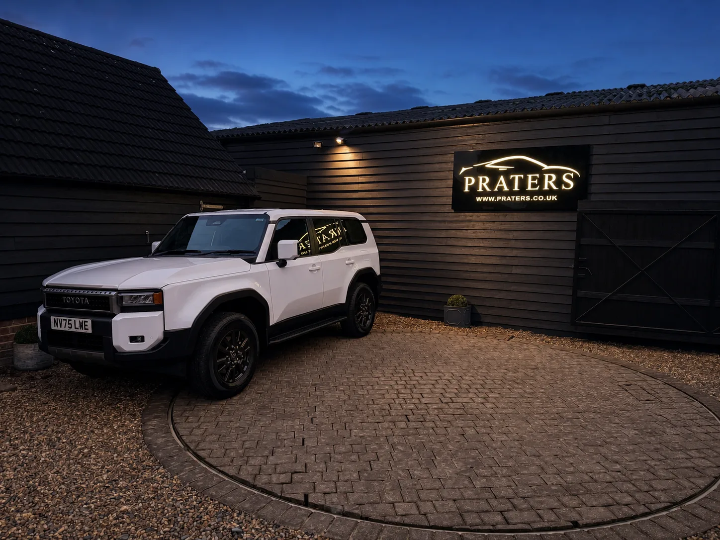
Illuminated signage · AutomotivePraters

A compact sign with presence after dark.

Praters needed an exterior identity that felt at home against a dark-clad building and remained useful beyond daylight hours.

The brief

The sign had to be legible from the approach, carry both the marque and website, and complement a deliberately understated black exterior rather than competing with it.

What we delivered

A gloss-black sign face lets the warm illuminated identity do the work. The restrained palette, generous spacing and bright edge definition give the logo clarity while preserving the premium feel of the setting.

Why it works

The result is a crisp landmark by day and a warm, unmistakable beacon at dusk. It creates a strong photographic backdrop and ties the physical premises directly to the Praters brand.

  • Illuminated sign
  • Exterior branding
  • Fabrication
  • Electrical installation
View the full project
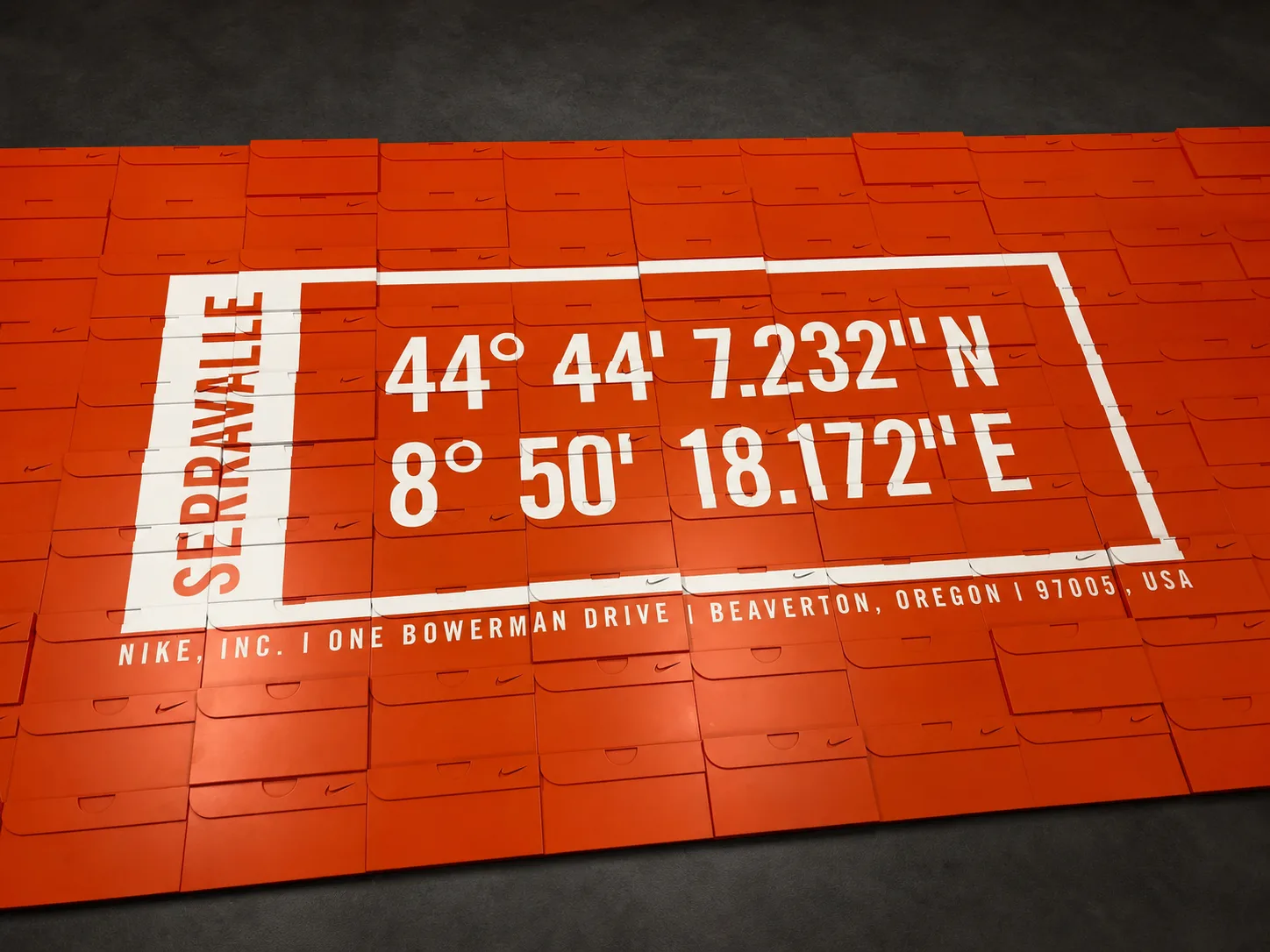
Bespoke fabrication · RetailNike · Serravalle

One graphic, registered across hundreds of moving parts.

A familiar retail object became the material for a large-format brand moment: an orange modular wall carrying the coordinates of Serravalle.

The brief

The challenge was precision. The white coordinate graphic and fine address line had to read as a single composition even though the surface was built from many individual, overlapping box-form panels.

What we delivered

We mapped the artwork across the full assembly, keeping typography and linework registered from module to module. Careful production checks in the workshop protected the large graphic while retaining the texture and small details of every panel.

Why it works

From a distance the installation lands as one bold, location-specific graphic. Up close, the repeated forms and tiny brand details reveal the fabrication behind it—exactly the kind of finish a feature wall should reward.

  • Bespoke display
  • Modular graphics
  • Precision production
  • Workshop assembly
View the full project
21+Years tradingSame workshop, same estate, since 1994.
2,400+Signs installedFrom single plaques to estate rollouts.
100%Fitted in houseNo subcontracted installation teams.
5 yrStandard warrantyTen on LEDs and powder-coated steel.

03 / Next

Your building could be the next one on this page.

Send a photograph and a rough size. We will come back with a scaled visual on your own elevation and a fixed price for making and fitting it.

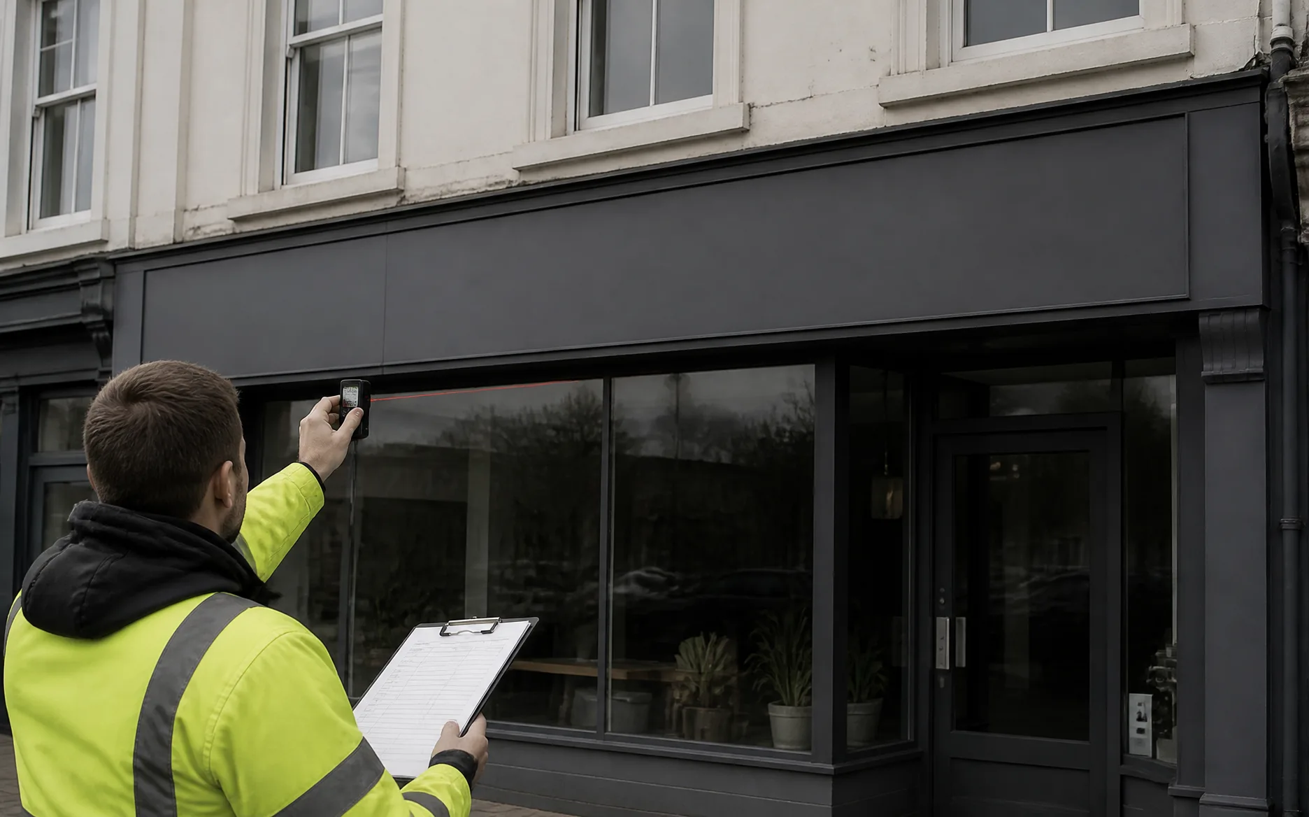
Surveyor measuring a shopfront fascia

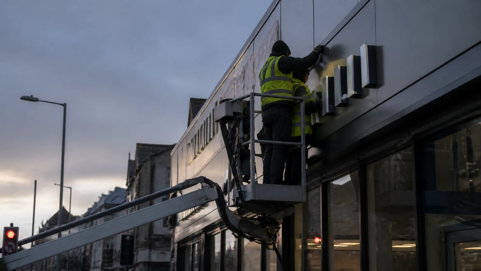
Crafting signs